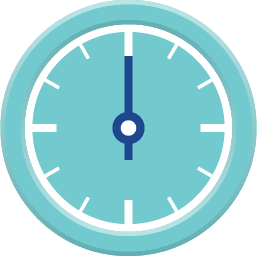
Circular Gauge is an input/output widget
As an output widget, this widget offers a complete set of meters. As an input widget, it can combine with the cicular needle and proper background to perform a turning knob function.
An educational vidoe is availble to get users started:
Circular Gauge
| Property |
Description |
Operation |
| Widget Name |
Widget displayed name |
Name |
| Link to User Manual |
Link to IOT’s website for User Manual |
|
Visibility Control
| Property |
Description |
Operation |
| Binding Hidden Control Register |
Select a binding register to control the visibility of this widget |
Checkbox |
| Hidden Control Register |
Choose a binding regsiter |
Register Selector |
Display Setting
| Property |
Description |
Operation |
| Display Text |
Display Text Label |
Checkbox |
| Text |
The content of the text label |
Plain Text |
| Font |
Set the typeface, font size, baldness, italics and line space for the text |
Font Selector |
| Text Color |
Select a color for the text label |
Color Selector |
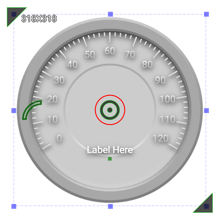
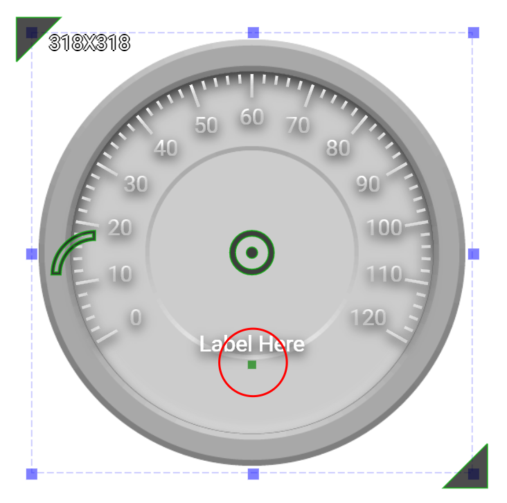
| Text Location |
Set the coordinate values for the text label |
Alignment Selector |
| Start Number |
Starting number for the circular scale |
Number Editor |
| End Number |
Ending number for the circular scale |
Number Editor |
| Reversed Scales |
Checked to reverse the progression of the scale. |
Checkbox |
| Start Angle |
Set the angle(1-359) for the starting point of the scale. Please refer to Number Editor |
Number Editor |
| Arc Length |
Set the arc length in degrees(1-360) |
Number Editor |
Needle Behavior Setting
| Property |
Description |
Operation |
| Minimum Data Value |
Set the minimum value that represents the starting value of the circule scales. This valume must be smaller than the maximum value of the binding register. |
Number Editor |
| Maximum Data Value |
Set the maximum value that represents the end value of the circule scales. This valume must be larger than the minimum value of the binding register. |
Number Editor |
| Binding Register |
Select a register of which value is represented by the needle |
Register Selector |
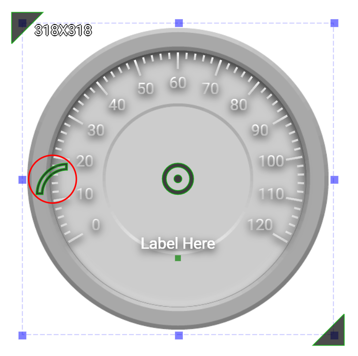
| Needle Top Left |
Set the coordinate value for the top-left corner of the needle |
Alignment Selector |
| Needle Bottom Right |
Set the coodinate value for the bottom-right corner of the needle |
Alignment Selector |
| Enable Slider Knob |
Onced enabled, this knob can be used to change the value of the binding register |
Checkbox |
| Load Needle Image |
Load an image from the file system as the needle |
File Open Dialog Box |
Outline Setting
| Property |
Description |
Operation |
| Display Outline |
Display outline |
Checkbox |
| Border Color |
Select a color for the border |
Color Selector |
| Border Style |
Select a line style for the border |
Dropdown List |
| Fill Color |
Select a color for the outline |
Color Selector |
Background Image Setting
| Property |
Description |
Operation |
| Show Background Image |
Show the background image |
Checkbox |
| Image Top Left |
Set the image’s top-left coordinates |
Alignment Selector |
| Image Bottom Right |
Set the image’s bottom-right coordinates |
Alignment Selector |
| Load Background Image |
Load an image from the file system as the background |
File Open Dialog Box |
Tick Style Setting
1st Tick Setting
| Property |
Description |
Operation |
| Enable Scale |
Enable the scales for 1st Tick |
Checkbox |
| Tick Granularity |
Set the tick’s granularity |
Number Editor |
| Tick Start Radius |
Set the tick’s starting position as a percentage (1-200%) of the radius |
Number Editor |
| Tick End Radius |
Set the tick’s ending position as a percentage (1-200%) of the radius |
Number Editor |
| Tick Color |
Select a color fot the ticks |
Color Selector |
| Tick Style |
Set the tick style |
Frame Selector |
| Display Number |
Display number on the ticks |
Checkbox |
| Display Start Number |
Display the starting number |
Checkbox |
| Display End Number |
Display the ending number |
Checkbox |
| Text Start Radius |
Set the number’s position as a percentage of the radius (1-200%) |
Number Editor |
| Number Font |
Set the typeface, font size, baldness, italics for the display number |
Font Selector |
| Number Color |
Select a color for the display number |
Color Selector |
2nd Tick Setting
| Property |
Description |
Operation |
| Enable Scale |
Enable the scales for 2nd Tick |
Checkbox |
| Tick Granularity |
Set the tick’s granularity |
Number Editor |
| Tick Start Radius |
Set the tick’s starting position as a percentage (1-200%) of the radius |
Number Editor |
| Tick End Radius |
Set the tick’s ending position as a percentage (1-200%) of the radius |
Number Editor |
| Tick Color |
Select a color fot the ticks |
Color Selector |
| Tick Style |
Set the tick style |
Frame Selector |
| Display Number |
Display number on the ticks |
Checkbox |
| Display Start Number |
Display the starting number |
Checkbox |
| Display End Number |
Display the ending number |
Checkbox |
| Text Start Radius |
Set the number’s position as a percentage of the radius (1-200%) |
Number Editor |
| Number Font |
Set the typeface, font size, baldness, italics for the display number |
Font Selector |
| Number Color |
Select a color for the display number |
Color Selector |
Shadow and Light Source Control
Move to Center
| Property |
Description |
Operation |
| Move to Center |
Move the center of the circle to the central point of the widget |
Center Editor |
Tick Style
| Property |
Description |
Operation |
| Tick Style |
Select a style for the ticks. Please refer to Color Selector |
|
Tick Head Style
| Property |
Description |
Operation |
| Tick Head Style |
Select a style for the tick head |
|
| Property |
Description |
Operation |
| Load Background Image… |
Load an image from the file system as the background |
File Open Dialog Box |
| Paste to Background Image from Clipboard |
Paste an image from Clipboard as the background |
|
| Edit Back Ground Image |
Edit the background image |
Image Editor Dialog Box |
| Link to User Manual… |
Connect to the education video and play it |
|