
Data Chart is an output widget. This widget draws line graph/chart according to the input data. It provides flexible settings such as background color, foreground colors, grid granularity and so on.
An educational vidoe is availble to get users started:
Data Chart
| Property |
Description |
Operation |
| Widget Name |
Widget displayed name |
Name |
| Link to User Manual |
Link to IOT’s website for User Manual |
|
Visibility Control
| Property |
Description |
Operation |
| Binding Hidden Control Register |
Select a binding register to control the visibility of this widget |
Checkbox |
| Hidden Control Register |
Choose a binding regsiter |
Register Selector |
Image Setting
| Property |
Description |
Operation |
| Show Protractor |
Show the protractor |
Checkbox |
| Show Background Image |
Show the background image |
Checkbox |
| Show Grid |
Show the grids |
Checkbox |
| Load Background Image |
Load an image from the file system as the background |
File Open Dialog Box |
Background Setting
Data Area Setting
| Property |
Description |
Operation |
| Top Left Corner |
Set the coordinate values for the top left corner |
Alignment Selector |
| Bottom Right Corner |
Set the coordinate values for the bottom right corner |
Alignment Selector |
| Data Update Mode |
Set the data update mode to be circulr or shift mode |
Dropdown List |
| Char Display Type |
Set the chart to be line, column, point or area mode |
Dropdown List |
| Data Series Opacity % |
Set the data serise opacity (0-100%) |
Number Editor |
| Data Series Width |
Set the data chart width |
Number Editor |
| Data Series Point Count |
Set the data point number on X-Axis |
Number Editor |
| Maximum Data Value |
Set the maximum data value for the Y-Axis |
Number Editor |
| Minimum Data Value |
Set the minimum data value for the Y-Axis |
Number Editor |
Grid Setting
| Property |
Description |
Operation |
| Grid Granularity |
Set the grid granularity
(X-aixs value of the chart’s bottom-right corner – X-axis value of the top-left corner)/X-axis of Grid Granularity = Number of grids on X-axis |
Alignment Selector |
| Grid Background Color |
Select a color for the grid background |
Color Selector |
| Grid Line Color |
Select a color for the grid lines |
Color Selector |
| Grid Line Style |
Select a line style for the grid lines |
Frame Selector |
Horizontal Scale Setting
| Property |
Description |
Operation |
| Show Horizontal Scale |
Show the horizontal scale |
Checkbox |
| Font |
Set the font’s type, size, style and line space |
Font Selector |
| Text Color |
Select a color for the texts |
Color Selector |
| Starting Number |
Set the starting number |
Number Editor |
| Granularity |
Set the granularity for increasement or decreasement. If the value is set to be minus, it is treated as the decreasement. |
Plain Text |
| Location |
Set the location of the horizontal scales |
Alignment Selector |
Vertical Scale Setting
| Property |
Description |
Operation |
| Show Vertical Scale |
Show the Vertical scale |
Checkbox |
| Font |
Set the font’s type, size, style and line space |
Font Selector |
| Text Color |
Select a color for the texts |
Color Selector |
| Starting Number |
Set the starting number |
Number Editor |
| Granularity |
Set the granularity for increasement or decreasement. If the value is set to be minus, it is treated as the decreasement. |
Plain Text |
| Location |
Set the location of the vertical scales |
Alignment Selector |
Grid Shadow Setting
| Property |
Description |
Operation |
| Grid Shadow Dx |
Set the grid shadow’s X-axis value |
Number Editor |
| Grid Shadow Dy |
Set the grid shadow’s Y-axis value |
Number Editor |
| Grid Shadow Color |
Select a color for the brid shadow |
Color Selector |
Data Series 1 Setting
| Property |
Description |
Operation |
| Enable Data Series 1 |
Enable Data Series 1 |
Checkbox |
| Binding Register |
Set the binding register of which value is shown by the data serier 1 chart
This register can NOT be the same as that of other data series. |
Register Selector |
| Color |
Select the color for Data Series 1 |
Color Selector |
Data Series 2 Setting
| Property |
Description |
Operation |
| Enable Data Series 2 |
Enable Data Series 2 |
Checkbox |
| Binding Register |
Set the binding register of which value is shown by the data serier 2 chart
This register can NOT be the same as that of other data series. |
Register Selector |
| Color |
Select the color for Data Series 2 |
Color Selector |
Data Series 3 Setting
| Property |
Description |
Operation |
| Enable Data Series 3 |
Enable Data Series 3 |
Checkbox |
| Binding Register |
Set the binding register of which value is shown by the data serier 3 chart
This register can NOT be the same as that of other data series. |
Register Selector |
| Color |
Select the color for Data Series 3 |
Color Selector |
Data Series 4 Setting
| Property |
Description |
Operation |
| Enable Data Series 4 |
Enable Data Series 4 |
Checkbox |
| Binding Register |
Set the binding register of which value is shown by the data serier 4 chart
This register can NOT be the same as that of other data series. |
Register Selector |
| Color |
Select the color for Data Series 4 |
Color Selector |
| Property |
Description |
Operation |
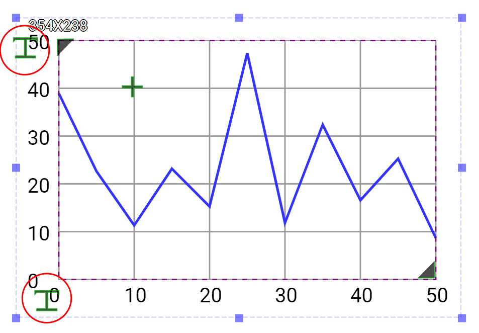 |
Set the locations of Horizontal Scales and Vertical Scales |
|
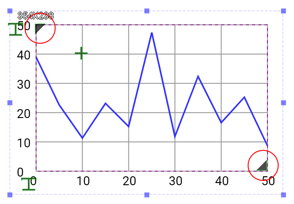 |
Set the chart size and location |
|
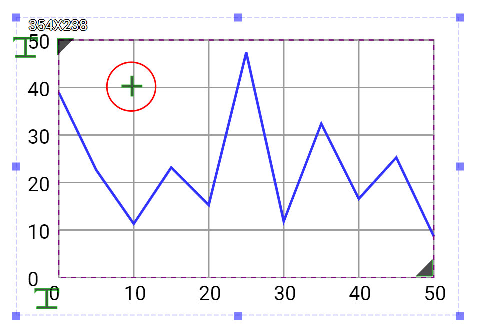 |
Set the grid granularity |
|
| Property |
Description |
Operation |
| Reset Ratio by Width |
Reset the size of the widget based on the original widget ratio with width unchanged |
Reset Editor |
| Reset Ratio by Height |
Reset the size of the widget based on the original widget ratio with height unchanged |
Reset Editor |
| Load background Image… |
Load an image from the file system as the background |
File Open Dialog Box |
| Link to User Manual… |
Connect to the education video and play it |
|