
Rotation Image is an output widget. It provides the rotation function for a still image. This widget is suitable for implementing the needle of a meter or gauge. It supports opacity and image layering. This widget can work together with other widgets to form complex widgets ehancing the visual effect of the HMI.
The performance and resource requirement is inversely propotional to the size of the image. The larger-sized image of this widget requires more memory space and computation resources.
An educational vidoe is availble to get users started:
Rotation Image
| Property |
Description |
Operation |
| Widget Name |
Widget displayed name |
Name |
| Link to User Manual |
Link to IOT’s website for User Manual |
|
Visibility Control
| Property |
Description |
Operation |
| Binding Hidden Control Register |
Select a binding register to control the visibility of this widget |
Checkbox |
| Hidden Control Register |
Choose a binding regsiter |
Register Selector |
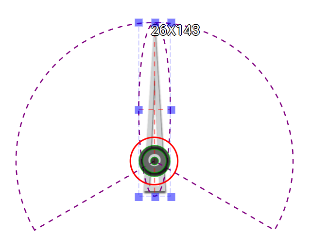
Center Location Setting
| Property |
Description |
Operation |
| Center Location |
Set the coordinate values for the center of the circle |
Alignment Selector |
| Move to Center |
Move the center of the circle to the central point of the widget |
Alignment Selector |
Rotation Setting
| Property |
Description |
Operation |
| Minimum Data Value |
Set the staring value of the needle. This value must be smaller than the maximum value of the binding register. |
Number Editor |
| Maximum Data Value |
Set the ending value of the needle. This value must be larger than the minimum value of the binding register. |
Number Editor |
| Revsered Scale |
Set the scale to be reserved.
That is to set the minimum value to be the ending value of the needed and the maximum value to be the staring value. |
Checkbox |
| Start Angle |
Set the needle’s starting angle (0-360). Please refer to Number Editor |
Number Editor |
| Arc Length |
Needle’s rotation arc length in degree (0-360) |
Number Editor |
| Load Rotated Image |
Load an image from the file system as the needle |
File Open Dialog Box |
Behavior Setting
| Property |
Description |
Operation |
| Enable Slider Knob |
Enale the knob
If the knob is enabled, this widget can become an input one as users can change the binding register’s value. |
Checkbox |
| Binding Register |
Select a binding regsiter whose value is represented by the needle |
Register Selector |
Preview
| Property |
Description |
Operation |
| Show Protractor |
Show the protractor
The protractor represents the range of the rotation |
Checkbox |
| Value |
Slider to select a value for the needle to display |
Number Editor |
| Property |
Description |
Operation |
 |
Adjust the location of the center of the circle |
Center Editor |
Move to Center
| Property |
Description |
Operation |
| Move to Center |
Move the center of the circle to the central point of the widget |
Center Editor |
| Property |
Description |
Operation |
| Reset to Original Size |
Reset the widget to its original size |
Reset Editor |
| Reset Ratio by Width |
Reset the size of the widget based on the original widget ratio with width unchanged |
Reset Editor |
| Reset Ratio by Height |
Reset the size of the widget based on the original widget ratio with height unchanged |
Reset Editor |
| Load Rotated Image… |
Load an image from the file system as the needle |
File Open Dialog Box |
| Pasted Rotated image from Clipboard |
Pasted an image from Clipboard as the needle |
|
| Link to User Manual… |
Connect to the education video and play it |
|