
Image Label is an output widget. The goal is to display text of Rich Text format and to support multi-languages. It can also display texts under user-installed fonts. The text must be edited in ADE and can not change during execution. This widget is suitable for elaborated signs and labels.
An educational vidoe is availble to get users started:
Image Label
| Property |
Description |
Operation |
| Widget Name |
Widget displayed name |
Name |
| Link to User Manual |
Link to IOT’s website for User Manual |
|
Visibility Control
| Property |
Description |
Operation |
| Binding Hidden Control Register |
Select a binding register to control the visibility of this widget |
Checkbox |
| Hidden Control Register |
Choose a binding regsiter |
Register Selector |
Shadow Setting
| Property |
Description |
Operation |
| Enable Shadow |
Enable shadow |
Checkbox |
Background Setting
| Property |
Description |
Operation |
| Main Color |
Select the main color for the background |
Color Selector |
| Gradient Color |
Select the gradient color for the background |
Color Selector |
Border Setting
| Property |
Description |
Operation |
| Border Color |
Select the color for the border |
Color Selector |
| Border Style |
Select the line style for the border |
Dropdown List |
| Property |
Description |
Operation |
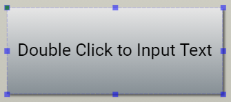 |
Double-click for entering text. Use Shift+Enter for inserting a new line |
RichText Editor |
Enable Shadow
| Property |
Description |
Operation |
| Enable Shadow |
Enable Shadow |
Checkbox |
| Property |
Description |
Operation |
| Remove Border |
Remove all borders and set the border line width to 0 |
|
| Make Squared |
Choose a larger value between the width and height and use it to change the widget shape to a square |
|
| Link to User Manual… |
Connect to the education video and play it |
|