Looking for help?
-
Getting Started
-
Install and Launch ADE
-
System Menu
-
Font Management
-
Toolbars
-
HMI Design Flow
-
Page
-
Widget Properties
-
- Name
- Checkbox
- Drop down list
- Plain Text
- Number Editor
- Font Selector
- Color Selector
- Alignment Selector
- Page Selector
- Register Selector
- Register Operation Setting
- Block Editor
- Image Collection Management
- Visibility Control
- Blending Mode Selector
- Open File Dialog Box
- Image Editor Dialog Box
- PlainTextArray Table Dialog
- Format String
- Label Display Mode
- Frame Selector
- Input Data Selector
- MessageBox Selector
- FileArray Table Dialog
- Event Setting
- Show Remaining Articles (10) Collapse Articles
-
-
Widgets
-
- Slider Switch
- Click Button
- Press/Release Button
- Momentary Push Button
- Generic Push Button
- Generic Latching Button
- Generic Button
- Multiple State Button
- Image List
- Animation
- Scrolling Label
- Date/Time Label
- Image Label
- Digits
- Circular Progress Bar
- Circular Meter
- Generic Progress Bar
- Horizontal Slider
- Vertical Slider
- Touch Area
- Bitmap Image
- Rotation Image
- Data Chart
- Generic Gauge
- Circular Scale
- Circular Gauge
- LED
- Palette
- Flexible Label
- Show Remaining Articles (14) Collapse Articles
-
< All Topics
Print
Color Selector
PostedMarch 18, 2024
UpdatedMarch 18, 2024
Byadminrdk
Views4
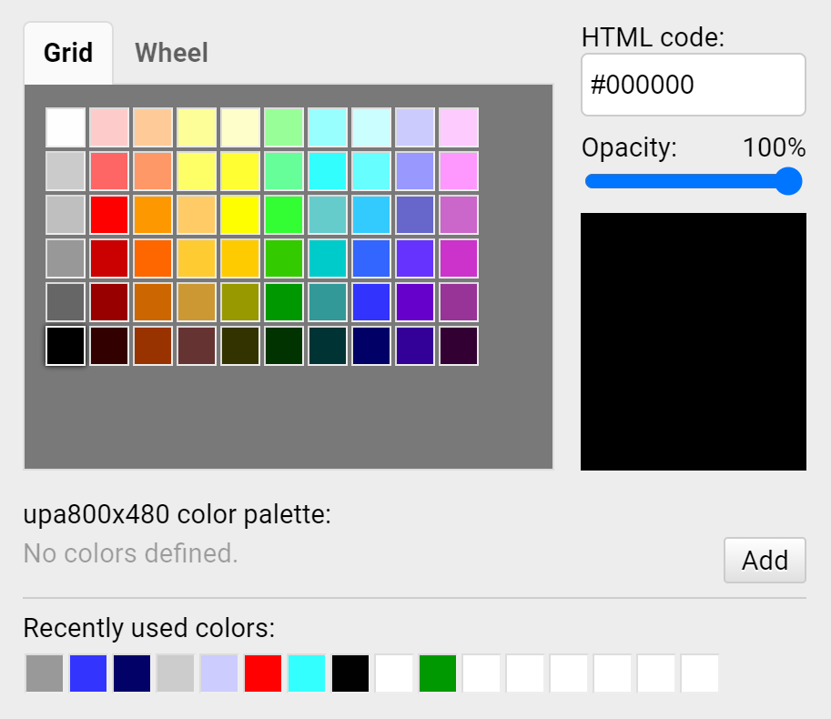
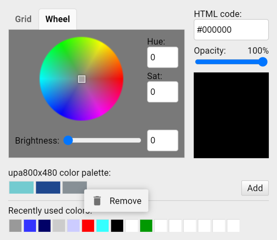
There are Grid and Wheel available for users to select colors or users can directly enter teh HTML code for colors.
The palette display the user-created colors. Users can use mouse right-click to remove a user-defined color.
For Circular Scale and Circular Gague widgets, the gradient color and the critical color can be set in the Color Selector. Critical Tick Ratio is also programmable.
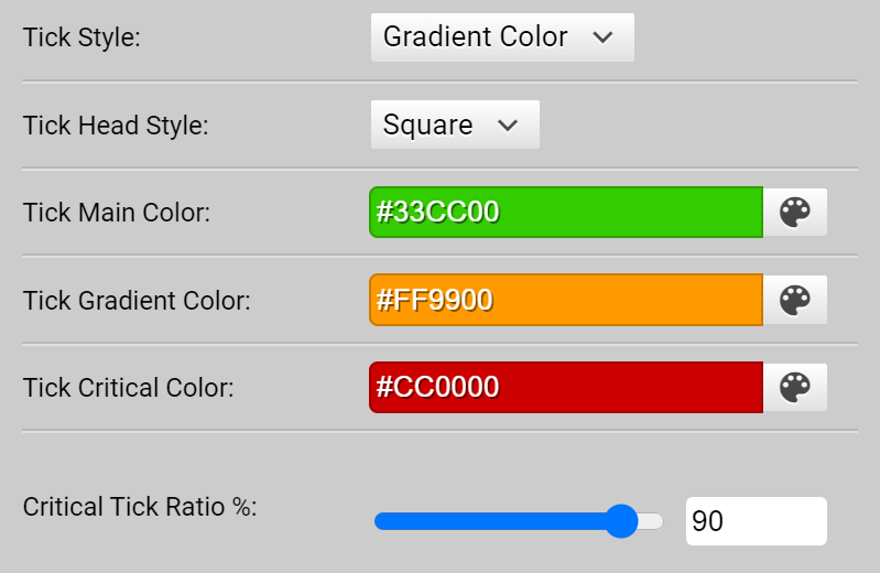
Table of Contents